Delang
Footwear Designed for Every Step
A modern footwear brand built around inclusivity, comfort, and everyday wear. We shaped a flexible identity system that reflects universality grounded in the idea that design should feel right for everyone, every day.
Branding
Concept
Know More
Delang is a modern footwear brand focused on inclusivity, comfort and everyday style. While specific details about the company’s operations remain limited the brand identity was developed to reflect universality and versatility values captured in their slogan “For Each of Everyone.”

The Project
Delang
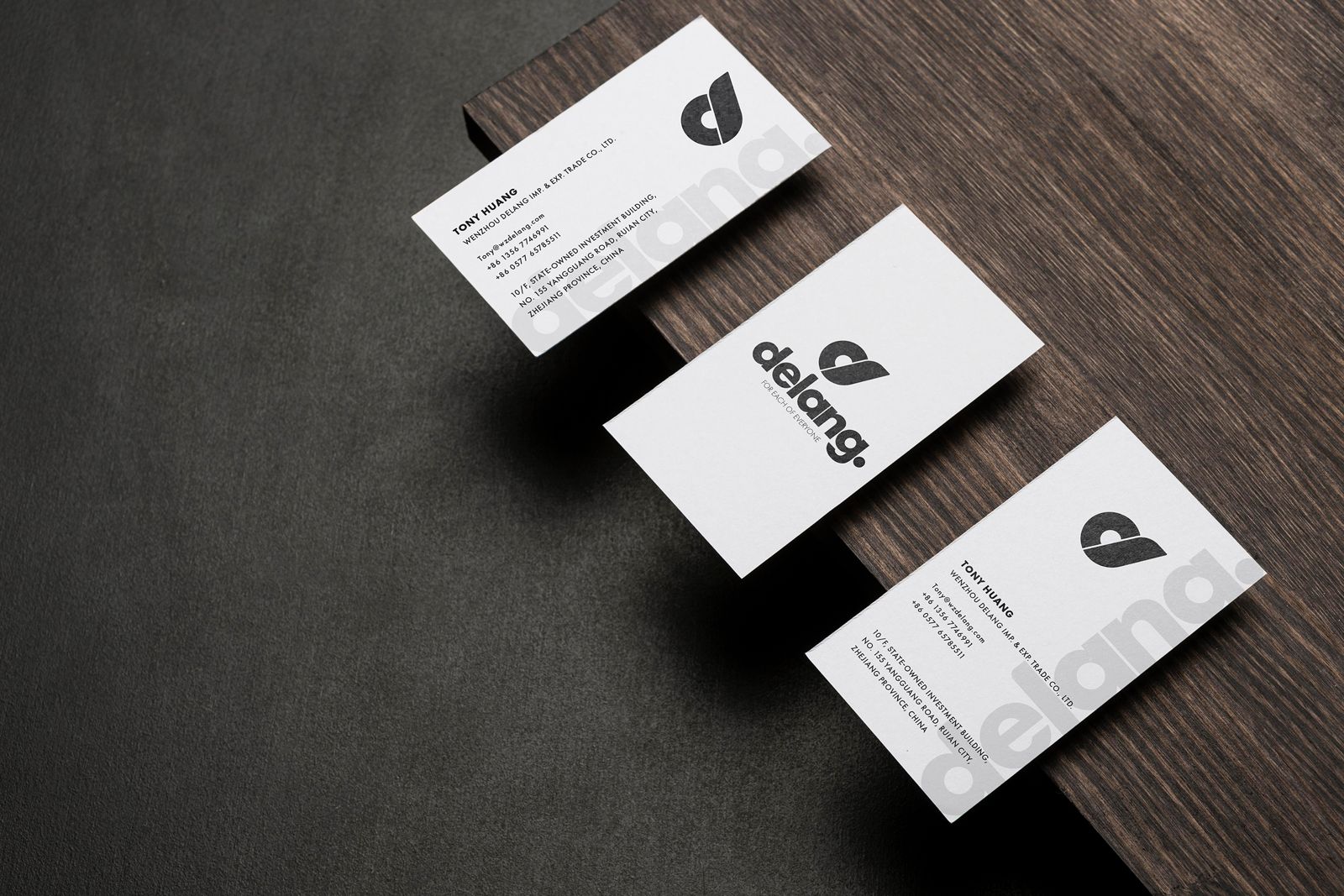
For Delang we created a full brand identity system that reflects simplicity, inclusivity and everyday usability. Our work included a custom logotype, visual language, grid system, color palette, typography and mockups.
The goal was to build a brand that feels approachable yet distinct one that could resonate with diverse audiences while remaining visually consistent across platforms. The brand’s slogan, “For Each of Everyone,” guided the creative direction and helped define a style that balances softness with strength.

Logo Concept
The Delang logo was designed to express simplicity flow and unity visually echoing the brand’s inclusive message "For Each of Everyone."
Its symbol is a minimal and fluid fusion of the letters d and l representing the name
Delang in an abstract yet recognizable form.
The mark integrates seamlessly with the logotype creating a harmonious identity that feels approachable and modern. Its soft curves and geometric precision convey both motion and clarity making it adaptable for use across fashion, packaging and digital environments.
Structure
Inspired by the Fibonacci sequence the logo’s line work is built on proportions that convey balance, clarity and natural harmony. The minimal outline reflects precision a core value in labOS’s approach to laboratory systems.
Color
The color palette was carefully selected to reflect the world labOS operates in. The soft green and clinical purple evoke a sense of innovation and calm. Orange brings energy and urgency while deep grey and black add contrast grounding the identity in professionalism and trust.
Typographic
This page introduces the Delang brand fonts, based on variations of the Futura typeface in Light, Book, and Bold weights. These fonts maintain a modern and minimal tone, ensuring legibility across print and digital platforms.
Logo font
Grid System
Grid System
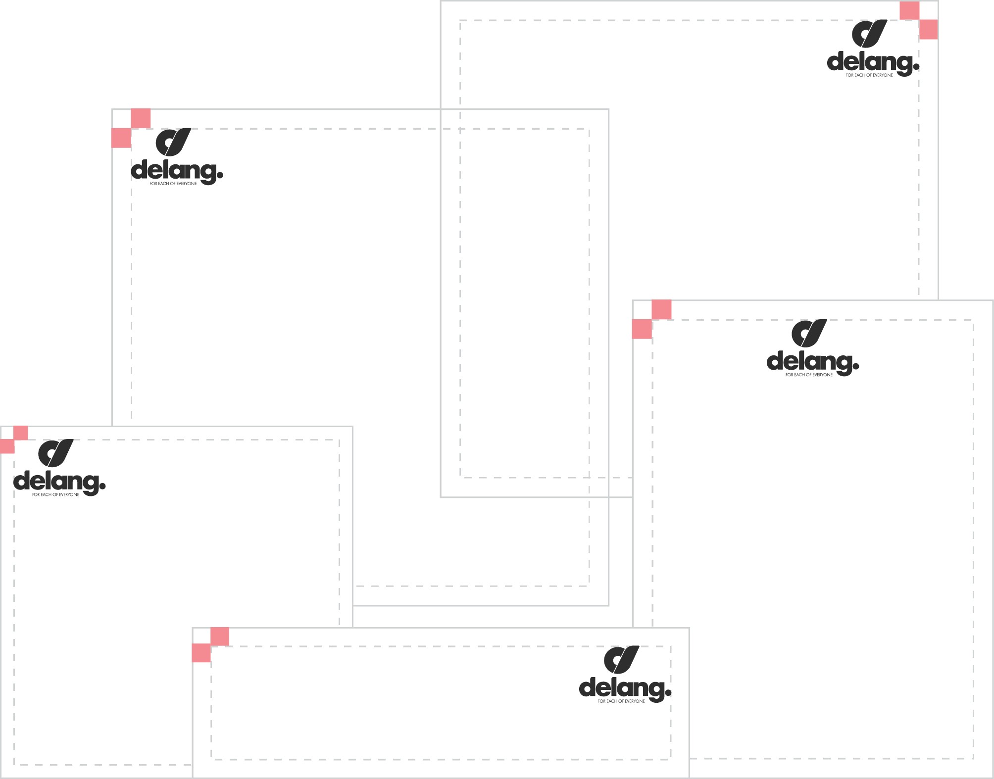
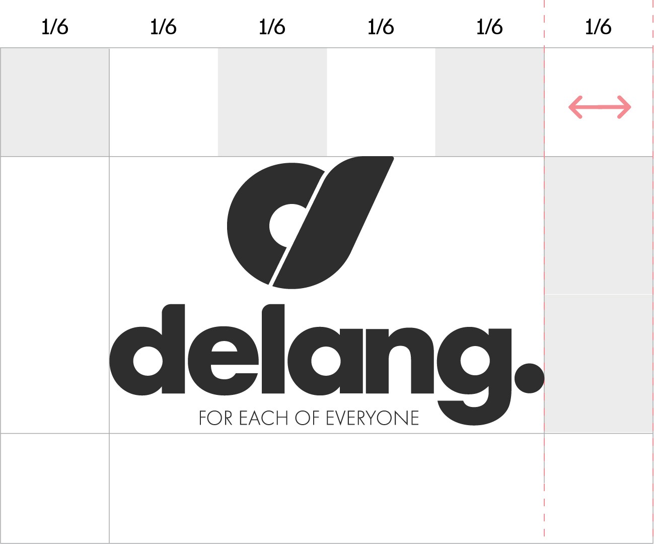
A structured 1/6 grid system is detailed here for use in layouts across both vertical and horizontal formats. This ensures visual harmony and consistent alignment in all branded materials.
Photographic Concept
Photographic Concept
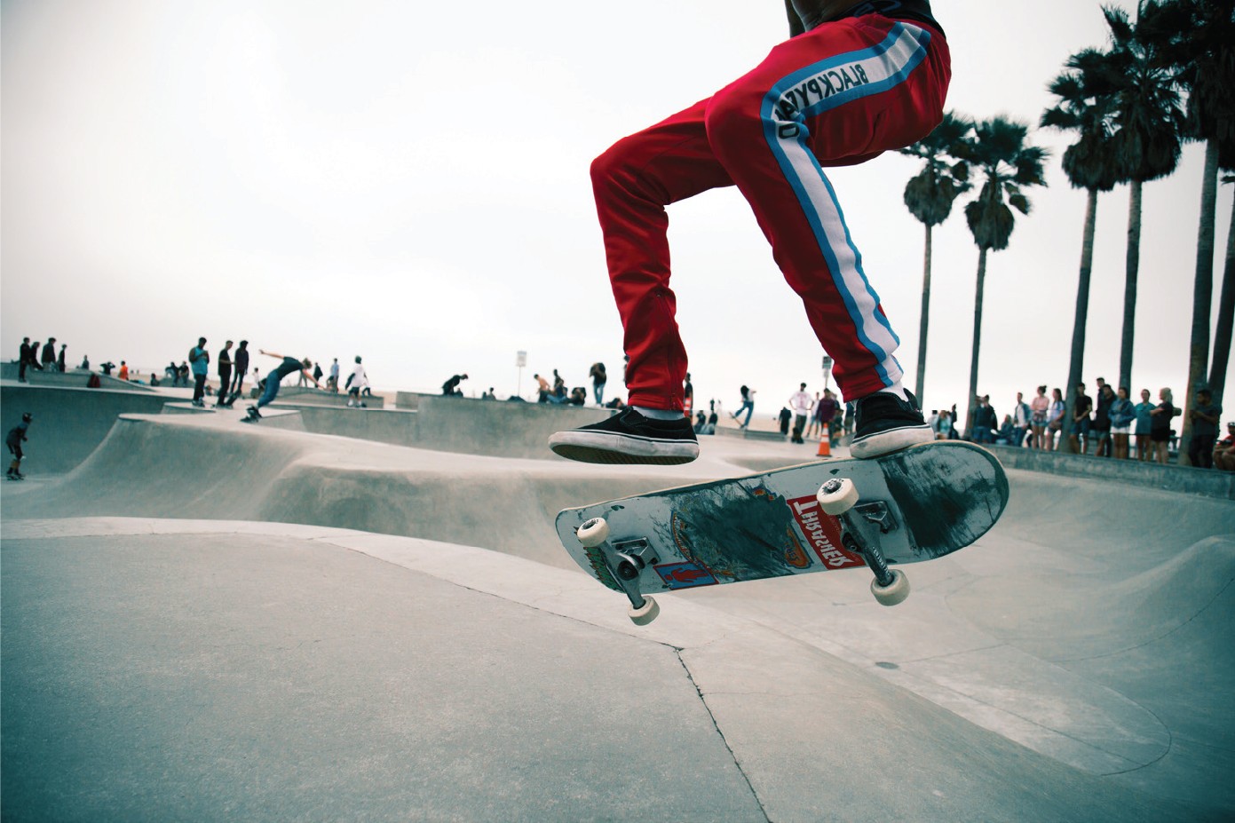
Delang’s visual language is rooted in urban authenticity and quiet confidence. The photographic style emphasizes minimal styling, deep shadows and muted tones reflecting a brand that’s raw wearable and inclusive by design.
Rather than showcasing individuals the focus is on atmosphere attitude and subtle branding. The imagery supports Delang’s core message: a brand made for everyone, blending seamlessly into real, everyday moments.